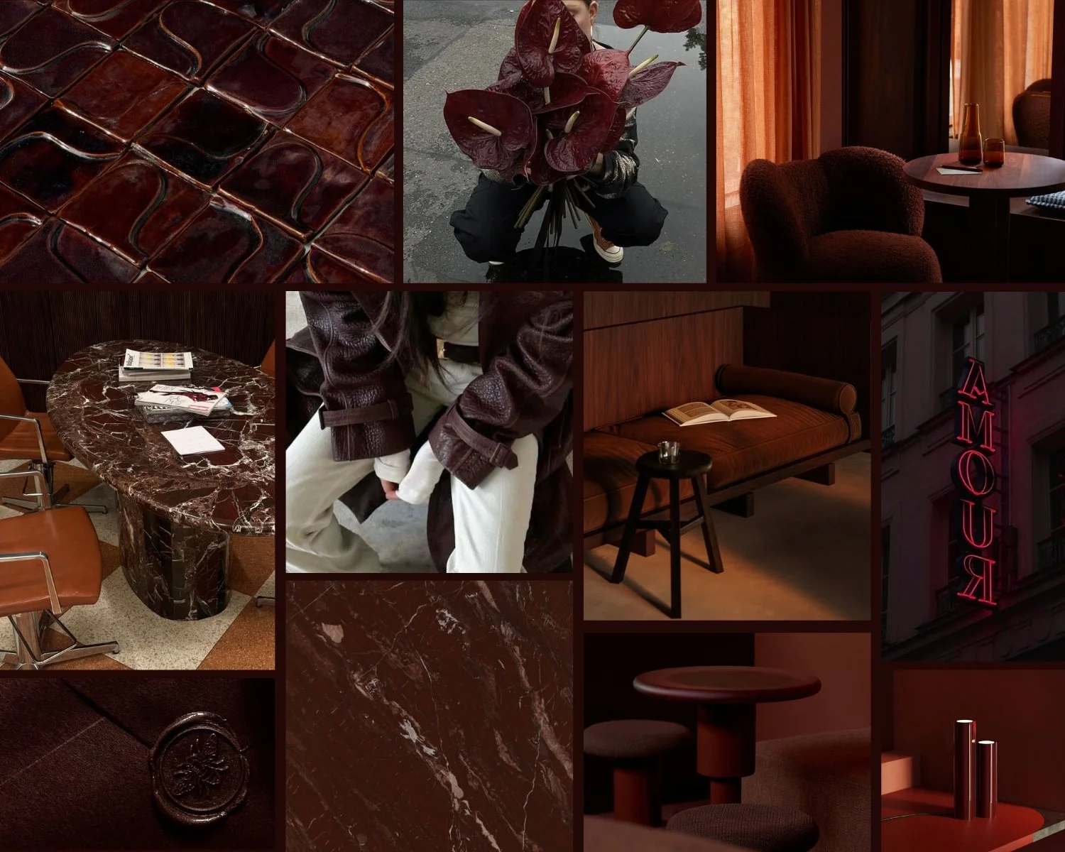
Hue. of the Month | Oxblood
A Hue for the Bold, the Sensual, and the Refined
Oxblood is not a colour for the faint of heart. It’s a shade for designers and brands who crave depth — for those unafraid to stand out, go deeper, and make a statement that lingers long after the first glance.
This hue evokes elegance, intensity, and quiet luxury. It calls to mind worn leather-bound books, dimly lit wine bars, velvet upholstery, deep autumn evenings, and the kind of confidence that makes you look twice. Oxblood carries a timeless, editorial richness that instantly elevates any space or brand palette.
Use it when you want to communicate:
• Elegance with edge
• Sophistication that feels lived-in
• Emotion, intimacy, and artistic depth
• A grounded, moody, heritage-inspired aesthetic
For branding, oxblood adds weight, texture, and memorability. It pairs beautifully with neutrals, metals, stone, and natural materials — ideal for designers drawn to understated uniqueness, romance, and a touch of mystery. In interiors, it becomes a grounding anchor or a dramatic accent that adds warmth without ever shouting.
If this hue is calling you, explore the Hue of the Month: Oxblood Edition on Pinterest — a curated collection of colour palettes, editorial imagery, textures, materials, and tonal references designed to spark your next mood board, brand concept, or design project.
